
Edit plot parts and data views
Select a series, change its appearance, and adjust axes or colour scales without rerunning the analysis.
Selecting inside plots
Selection follows Figma’s logic, tuned for plots:
- A plain click (or drag) anywhere on a plot always takes the whole plot — you can use empty space inside its rectangular bounds even when the SVG background is transparent. You can never accidentally drag one bar out of a chart.
- Ctrl+click pierces to the exact part under the cursor — a series’ line, one point, an axis label — even on an unselected plot. Hold Ctrl and hover to preview what you’d get; a data part also shows its readout beside the box — a point’s x and y, a bar’s category and height, a hexagon’s count, a heatmap cell’s value, a box’s statistics, a significance bracket’s test and p — read from the plot’s manifest, never from the picture.
- Double-click descends a level: into a group, into a plot’s parts, into text editing, into a path’s nodes.
- Whatever part you’ve drilled stays plain-draggable, and Escape steps back out one level at a time.
Restyling parts
With a part selected, press F to open Properties and restyle it — colour, width, size, font, opacity, visibility, even a positional nudge in the plot’s own units. The same fields sit in the right rail’s Plot part section. Part edits are stored as overrides keyed to the part’s stable name, so they survive regeneration of the plot. Recolouring a series’ whole line or points repaints its legend swatch too, so the key never lies about the colour; recolouring one bar or one point is a highlight and leaves the key alone.
When the picked part belongs to a plain series, the Plot part section also offers Series colour: one colour for the whole series — its line, its markers’ faces and edges, its bars or band, its error bars and its legend swatch — written as one override per part, so it survives regeneration like any part edit, with reset to return to the generated colours. A colour-mapped series (a heatmap, a hexbin, a scatter coloured by value) has no series colour: edit its Colour scale instead. From the command line, the same edit is flux set-series-color (command reference).
X-ray
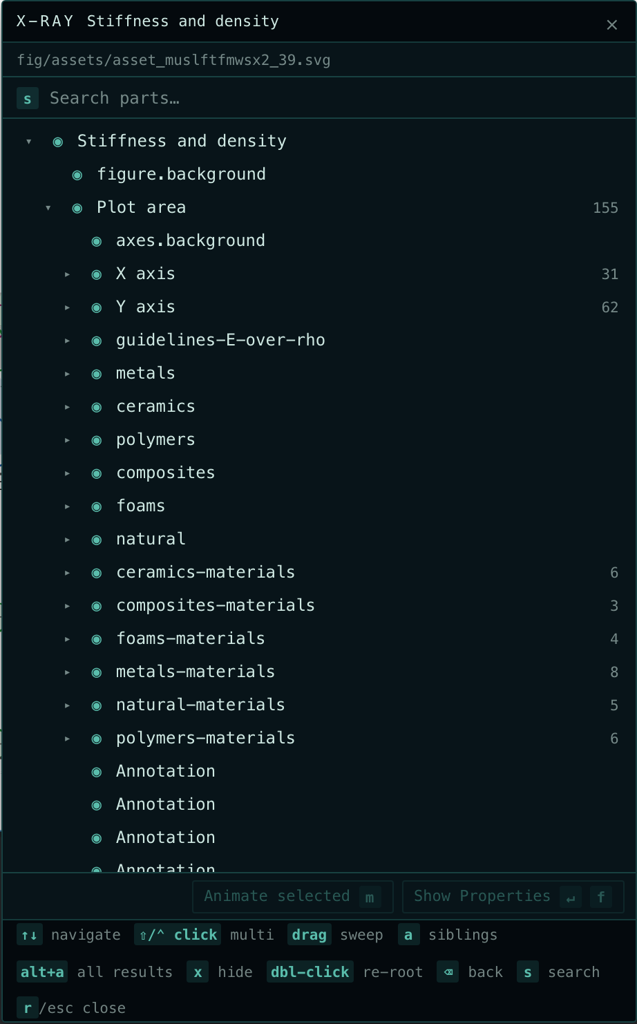
Alt+R opens the X-ray: the anatomy of the selected plot (or group) as a tree, placed beside the selection.
- Walk the tree with the arrow keys, and hide or show any part with x.
- Enter (or F) selects the picked parts and opens their properties.
- For recipe-backed plots, Regenerate reruns the script that made the plot, right from the panel. You can inspect another plot while a recipe runs; its result still belongs to the plot you regenerated.
- Double-click a row (or press Ctrl+Enter) to re-root the X-ray on it. Keyboard navigation keeps the active row in view.
Rows multi-select: Shift+click picks a run, Ctrl+click toggles one, Ctrl+A picks everything, Alt+A picks every search result, and a press-and-drag over rows picks the run you sweep (hold Ctrl when you press to add a second sweep to the pick). a widens the pick to its siblings: first the same part under each sibling of its parent (X axis › Tick marks adds Y axis › Tick marks), then, pressed again, every row under the same parent. x, Enter and the property menu then act on all of them, so you can hide five series at once or restyle them together.
Select several plots before pressing Alt+R and the X-ray shows each plot’s tree plus a Common parts list of what they all share, so hiding the x-axis of four plots is one row and one keypress.
Dissecting a plot
A summary plot usually hides a story — twenty subjects behind one regression line, a table of statistics behind one asterisk. D with a plot selected opens Dissect: a viewer for that plot’s companion material, which lives in plots/_dissections/<plot name>/. Drop per-subject panels, alternative analyses, or stats CSVs there (subfolders become tabs) and they’re one keypress away from the composed figure — without ever appearing in the plot importer or your figures.
Inside the viewer: arrow keys move around the grid, Enter expands a file (Ctrl+scroll zooms images at the cursor, Space+drag pans, Enter toggles fit/1:1), CSV and TSV files open as sortable tables, and Escape steps back out. The ⧉ button shrinks the viewer to a floating window you can keep beside the canvas; files dropped into the folder while it’s open appear live. The Inspector’s Dissections button (with a count) does the same as D — and for a plot with no dissections yet, it offers to create the folder.
Axis view
Select a plot with a manifest containing series and calibrated axes to edit Axis view in the Inspector. The controls are unavailable without axes and series; an unsupported axis is disabled with its reason. Each supported axis has min and max in data units and a linear/log scale. An empty field uses the generated plot’s limit, shown as its placeholder. Reset restores both generated axes. Typing or wheeling previews the change; finishing the edit makes one undo step, and Escape cancels it.
The F menu offers x view (v) and y view (b); on cropped plots, follow the row’s displayed key when v is already assigned. Once a view is open there, the mouse wheel adjusts the focused limit wherever the pointer is (the canvas does not zoom); Space accepts the minimum and moves to the maximum, and Space again (or Enter) accepts it and returns to the menu. In X-ray, select an axis row and press v for Axis view… to focus that axis in the Inspector.
Lines, points, bars, heatmap cells, hexagons, contour bands and box or violin bodies re-project inside the existing plot frame; exports include the same view. A viewed axis is re-ticked: its generated ticks, labels and gridlines give way to a fresh set laid out for the new limits (nice steps with matching labels on a linear axis, decades on a log one; an axis of categories, dates or fixed labels keeps its own ticks, which move with their values and fade in the outer 4%). Non-series marks, such as a dashed reference line, and raster layers stay put. A log view needs positive limits and positive data. For multi-panel plots the view applies to all panels; placeholders show the first panel.
A plot with a twin value axis (an ax.twinx() or twiny() in fluxplot 0.3.2 or later) shows a y2 (or x2) row too: the twin’s own limits and scale, applied to the series drawn on it while the panel’s other series stay where they are. A secondary axis that only relabels its parent through a function follows the parent and has no row of its own.
Colour scales
A colour-mapped plot saved by fluxplot 0.3.1 or later (hexbin, heatmap, scatter with c=, contour bands, colour-mapped bars and lines) records each colour scale’s exact law — its colormap table, its normalisation and limits — and every coloured element’s data value. Select the plot to edit Colour scales in the Inspector, one block per scale.
In the F menu, the colour scale row (c, or the key the row displays) opens the editor with the whole menu to itself, widened to fit: the controls on the left and the palette list always open on the right, so trying a palette is one click (or ↑/↓ and Enter); Escape returns to the other properties. X-ray shows the same controls under the plot’s regenerate controls; it widens while its palette list is open, and a wide list shows each type’s maps in two columns.
- Palette takes any colormap fluxplot ships, typed by name or picked from the collections behind the preview bar. Reverse flips it.
- Norm offers the kinds the scale allows (linear, log, power, symlog). A centre appears for two-slope norms, gamma for power, and the linear threshold and scale for symlog.
- Min and max are in data units. Extend chooses which out-of-range arrows the key shows.
Every element recolours as you type, together with the key’s gradient and its ticks, and nothing regenerates. An empty field uses the generated value shown as its placeholder; finishing an edit makes one undo step, Escape cancels it and Reset restores the generated scale. An edit that cannot be painted, such as a log minimum at zero or a minimum above the maximum, is refused with its reason and the plot keeps the last valid colours. A scale that also carries an opacity channel (fluxplot’s alpha_by: a hexagon’s count, a cell’s p-value) keeps every element’s opacity through a recolour; the block names the channel and its range, and the channel itself is edited in the source.
Live edits are element state: they are saved with the figure, honoured by exports and Paper embeds, tween in slides and travel with copies of the plot. Apply to source writes the complete colour controls of every scale into the plot’s recipe, regenerates the plot from its data and clears the live edit, so the source file paints the same colours; it needs a runnable recipe. A scale drawn as one raster image reports itself and can only regenerate. Older plots without a recorded scale keep the regenerate-only palette and range fields.
From the command line, the same edit is flux set-plot-color-scale. On slides, a colour-scale change can also animate between steps; see Transforms and data morphs.
View as
View as… in the toolbar shows the whole canvas the way a colour-deficient reader sees it — deuteranopia, protanopia, tritanopia (Machado 2009 at full severity, the same simulation fluxplot’s accessibility lint uses) — or in greyscale (luminance, what a black-and-white print keeps). It is a way of looking, applied as a display filter over the canvas: nothing in the figure changes, exports are untouched, and it lasts for the session. Use it while choosing series colours or a colormap; a pair of series that merge under deuteranopia need a different pair.